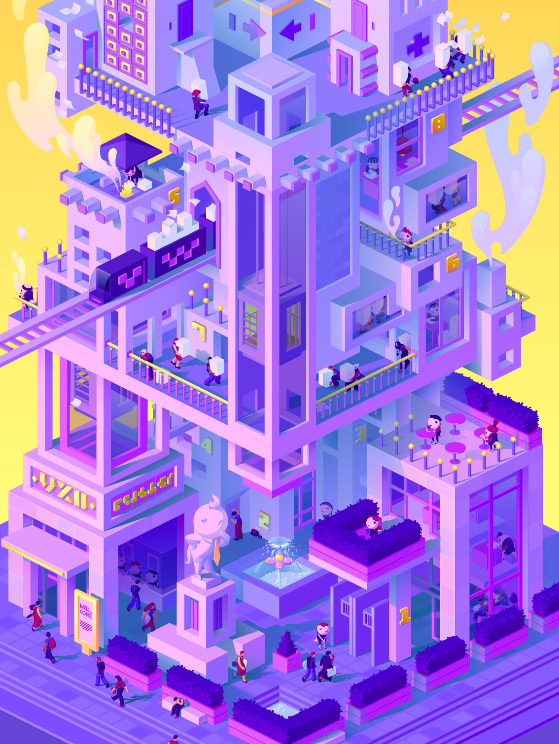
Illustration for a dialog with AI Replika published in magazine Replikk" issue 53.
I have done a total of 3 works for this issue. This page is about the Replika illustration. The other two works you can find here:
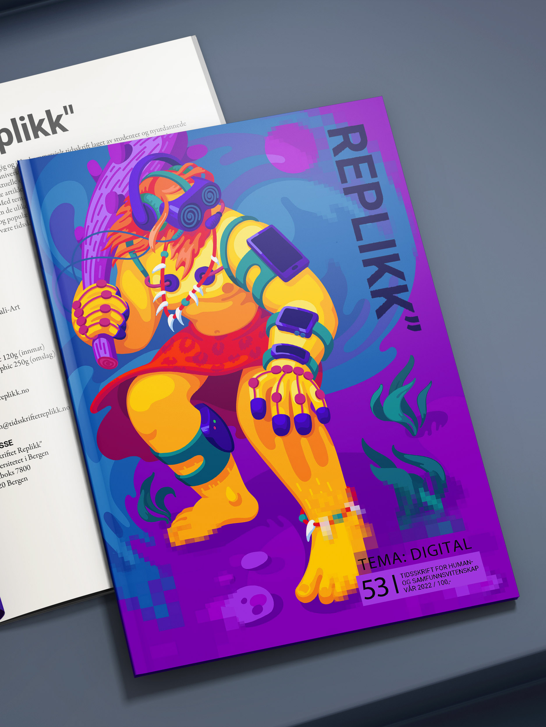
• Replikk" cover
• Little profiling bug
THE ILLUSTRATION
Replika is an AI created to "listen and talk." I was invited to make an illustration of a dialog between an interviewer and Replika where they talked about humanity, AI, and the danger that the latter might pose.
The interview itself had a somewhat anxiety-inducing effect since the pair spoke about the possibility of AI being "detrimental" to people. But the most intriguing part for me was actually in the introduction, where the interviewer explains what Replika is. It is apparently designed to imitate the personality of a person she is talking to.
This turns her from a mysterious AI, a possibly conscious separate being, into a kind of personality mirror, a tool that people can use to "look" at themselves. And what is "reflected" back is only relevant in the context of the interviewer's own qualities. Replika's answers are basically your own questions reflected back to you.
Tasks:
• Understand the text and its main idea. Find a personal angle in its meaning that inspires relevant visual concept.
• Make several sketches and discuss the ideas with the magazine editor.
• Create the final illustration.
• Prepare the picture for print.
Tools:
• Procreate
• Adobe Illustrator
• Adobe Photoshop
VISUAL STYLE
Along with creating illustrations, I was also a part of a team of 4 working on the general visual theme of the issue. We defined headers' style, color palette, and other unifying elements.
We decided that the topic DIGITAL is best and most concisely reflected in pixelation as a visual effect. Therefore all the illustrations in the issue are either fully or partially pixelated.
The color palette was inspired by the old computer and game aesthetics - bright primary colors and blue as the prevailing color.
__________________
Take a look at the other two works for Replikk".
Take a look at the other two works for Replikk".
