The process of developing a cohesive visual style for a VR game
This page is strictly about the visual concept of the game. To read more about the game itself and the idea behind it, please visit: GET IT IF YOU CAN
Game description
GET IT IF YOU CAN is a virtual reality survival game. The main character of the game (and the player's "body" and role in it) is an astronaut. He arrives at an abandoned space station searching for the mysterious Dust that can create life on any planet. The Dust is hidden behind a locked safe door, and the player's task is to find that key.
The station in the game is a hostile space taken over by a strange alien plant culture. It provides for its survival by robbing the occasional visitors of their oxygen. To do that, the elements of the station were rearranged and adapted to make traps for the astronauts. The station tries to misinform and confuse visitors and manipulate them into giving their oxygen away. The tricks, interactions, obstacles, puzzles, and some of the visual elements in the game are based on the Dark Patterns manipulation principles (more about them you can find here: GET IT IF YOU CAN).
Requirements
• Since the game is intended for VR, it requires creating a space using 3D graphics. Oculus Quest 2 was chosen to be the target device for the game. The main feature of Oculus is that it is an android based VR set that does not require to be attached to an external computer. But that also means that it has less powerful rendering capability and requires the 3D graphics to be simple - the low poly style.
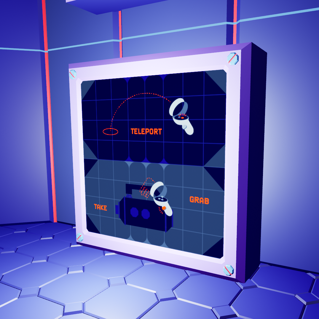
• The game needs screens, animations, and other 2d graphics. It has to be visually related to the 3d space elements.
• Story-wise, the station is abandoned, so the style should have a retro feel.
TASKS:
• Create a visual system that unites both 3D and 2D elements of the game.
• Analyse low poly style and translate its aesthetics to the flat elements of the game.
• Come up with specific shapes that could be implemented in both 3D and 2D graphics.
• Come up with a color palette for the game.
• Produce assets and graphics for the game: UI, environment, textures, etc.
SOFTWARE:
• Blender
• Blender
• Illustrator
• After Effects
• Unreal Engine

________________________
VISUAL CONCEPT
VISUAL CONCEPT
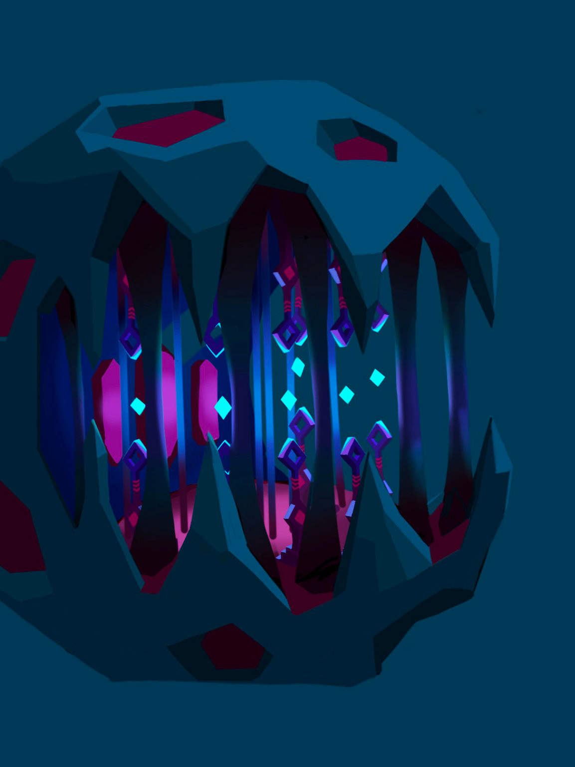
This schematic representation of the Dust in a glass container demonstrated all three main elements that ended up being the basis for the entire visual aesthetics of the game:
GRID
Conceptually, the game is created on the theoretical base of online manipulation tactics. It uses them as both inspirations for the challenges in the game and blueprints for the specific interaction scenarios. Online graphics (websites, applications) are usually based on grids. Therefore grid elements are also used here as a connection online world.
The primitive grid used here also serves here as a retro element that reminds us of the retro graphics aesthetics of early computers and screens. Its structure also is reflected in the tiles of the station. On the one hand, it provides for the fain connection to the computer keyboard while, on the other hand, giving a handy basis for playing with the level of "decay" of the station's architecture.
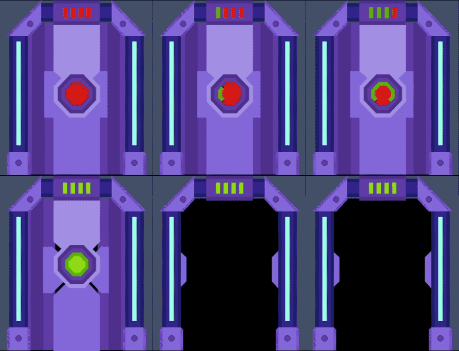
CUT-OFF CORNERS
CUT-OFF CORNERS
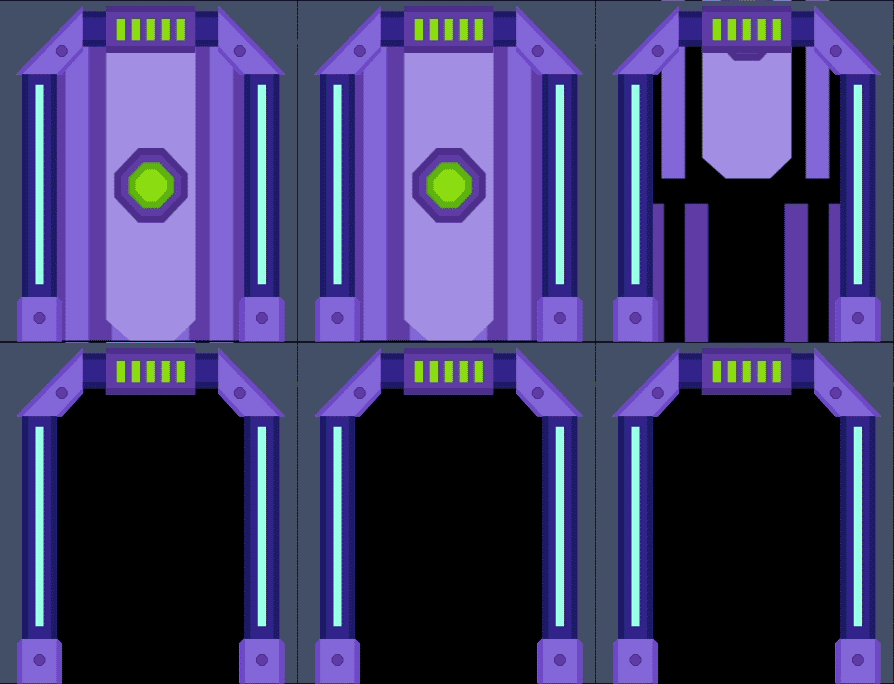
This element is one of the main connections to both the grid and the low poly 3D aesthetics. Low poly requires keeping the number of surfaces of the 3D objects to a minimum. This approach allows for making ultra simplified "rounded" objects and also provides for some possibility for decorating the square ones.
DIAMOND
The diamond shape in the game is mainly related to everything that has to do with the Dust. In the game story, it is the ultimate goal for the player and a kind of magical element that stands a bit apart from the other "real" objects of the space.
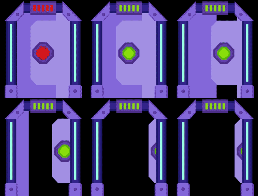
GRID: Elevator damage screen
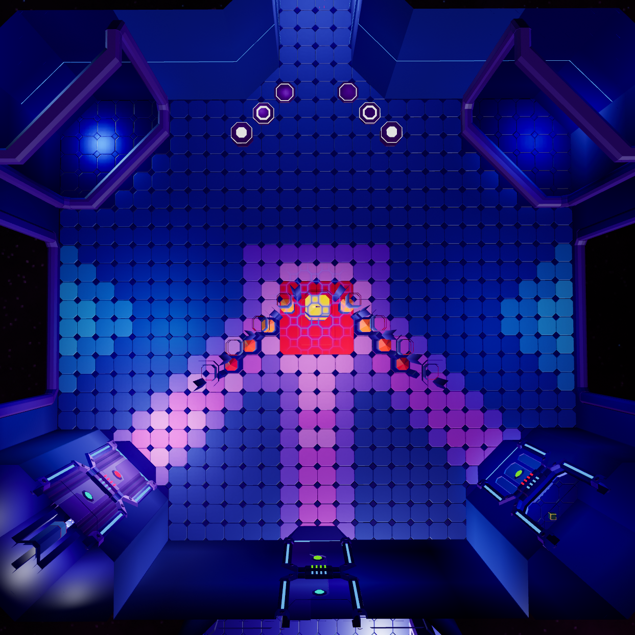
GRID: Lobby room floor
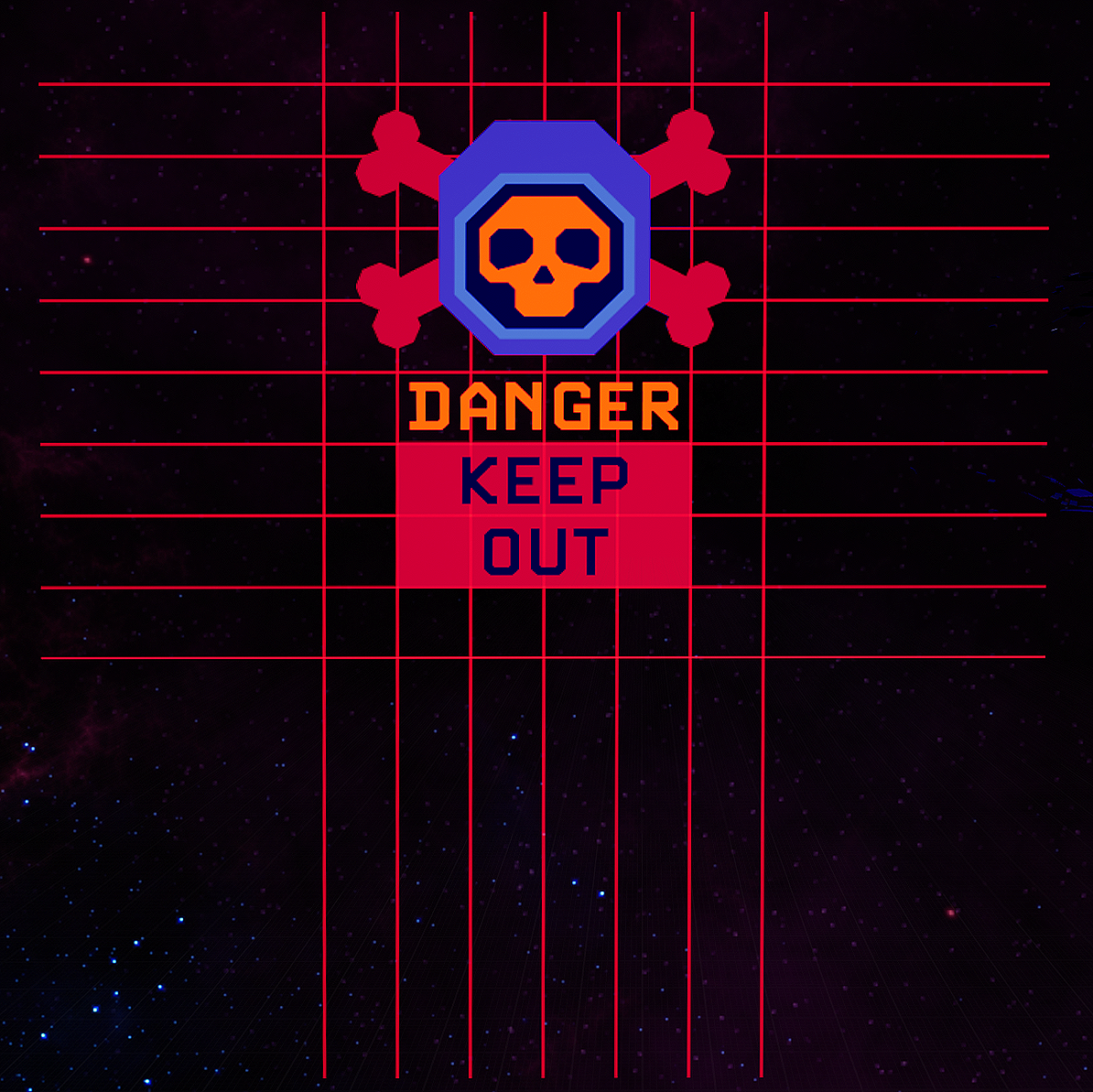
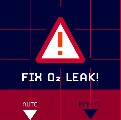
GRID: Danger pop-up
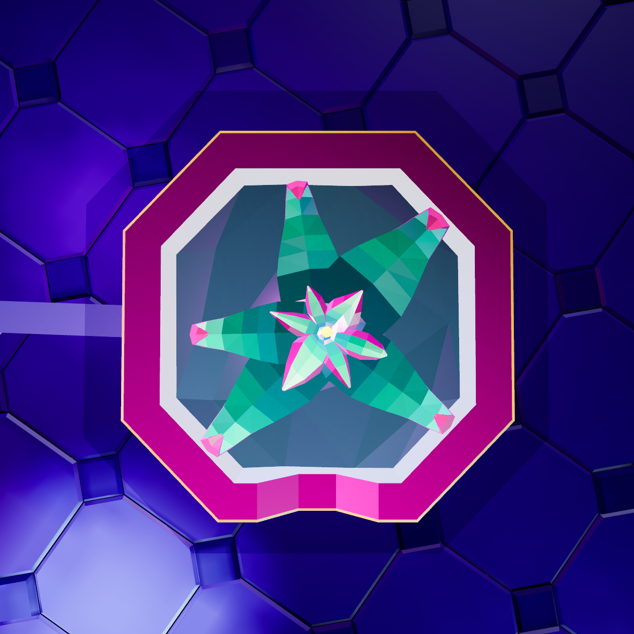
CORNERS: Plant pot
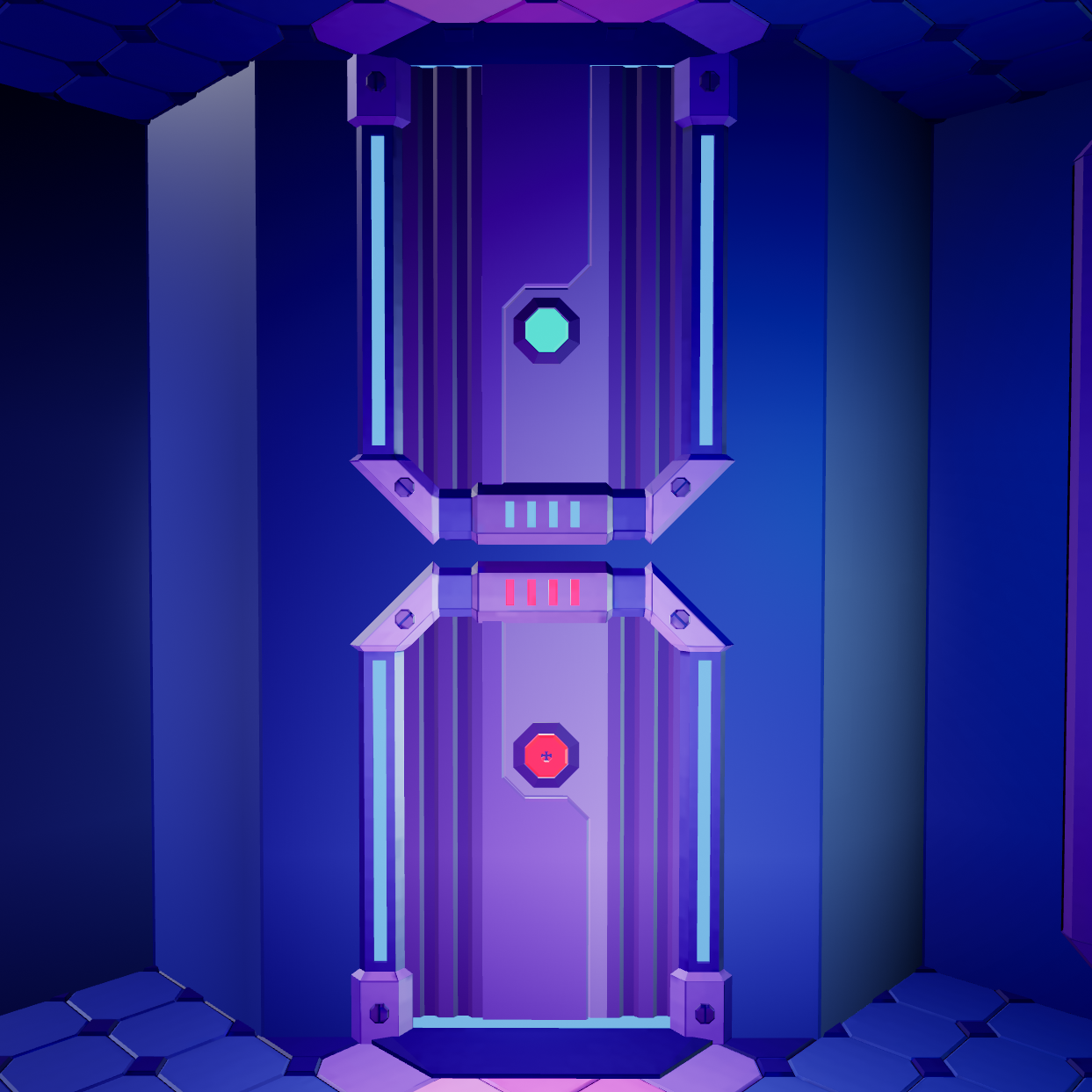
CORNERS: Dust safe door
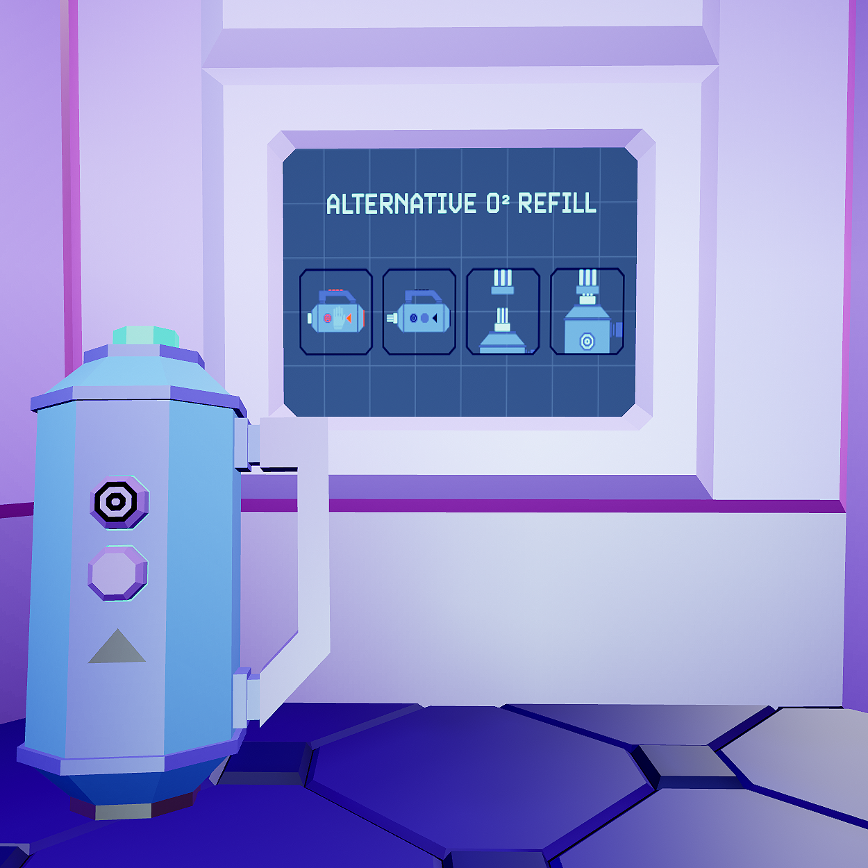
CORNERS: Oxygen tank refill instruction

DIAMOND: You Win screen
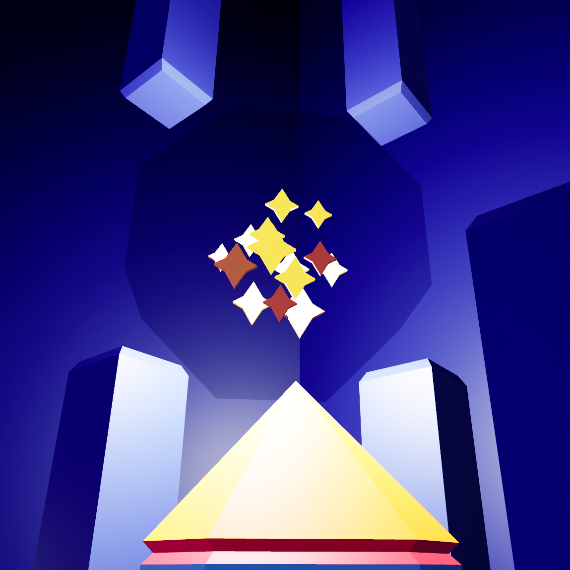
DIAMOND: Dust in a glass container
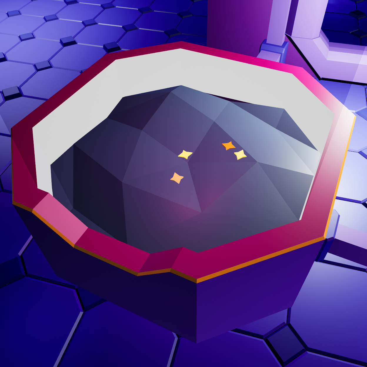
DIAMOND: Dust particles in a plant pot
________________________
COLOR PALETTE
COLOR PALETTE
The color palette had two main functions in the game:
• to direct attention
• to color-code different game actors
This way, all of the architectural elements of the station are colored in a spectrum of blues and purples (dark and cold) and occasionally highlighted with warm red and orange that create color dominant points of attraction for the eyes. Those are usually spots and objects in the game that are either important for the completion of the game or are there to mislead and confuse.
Almost everything to do with the spaceman's body is grey. Apart from the hands and some accessories (such as a torch-holding helmet and a watch), the player doesn't really get to see any other body parts since they are not essential to the game's interactions.
The plants on the station are colored in greens and pinks. The more they resemble the Earth plants, the more greens they have in their coloring.
The turquoise of the palette is reserved for everything that has something to do with oxygen. And the bright yellows are for the Dust.
________________________
THE PLAYER CHARACTER
THE PLAYER CHARACTER
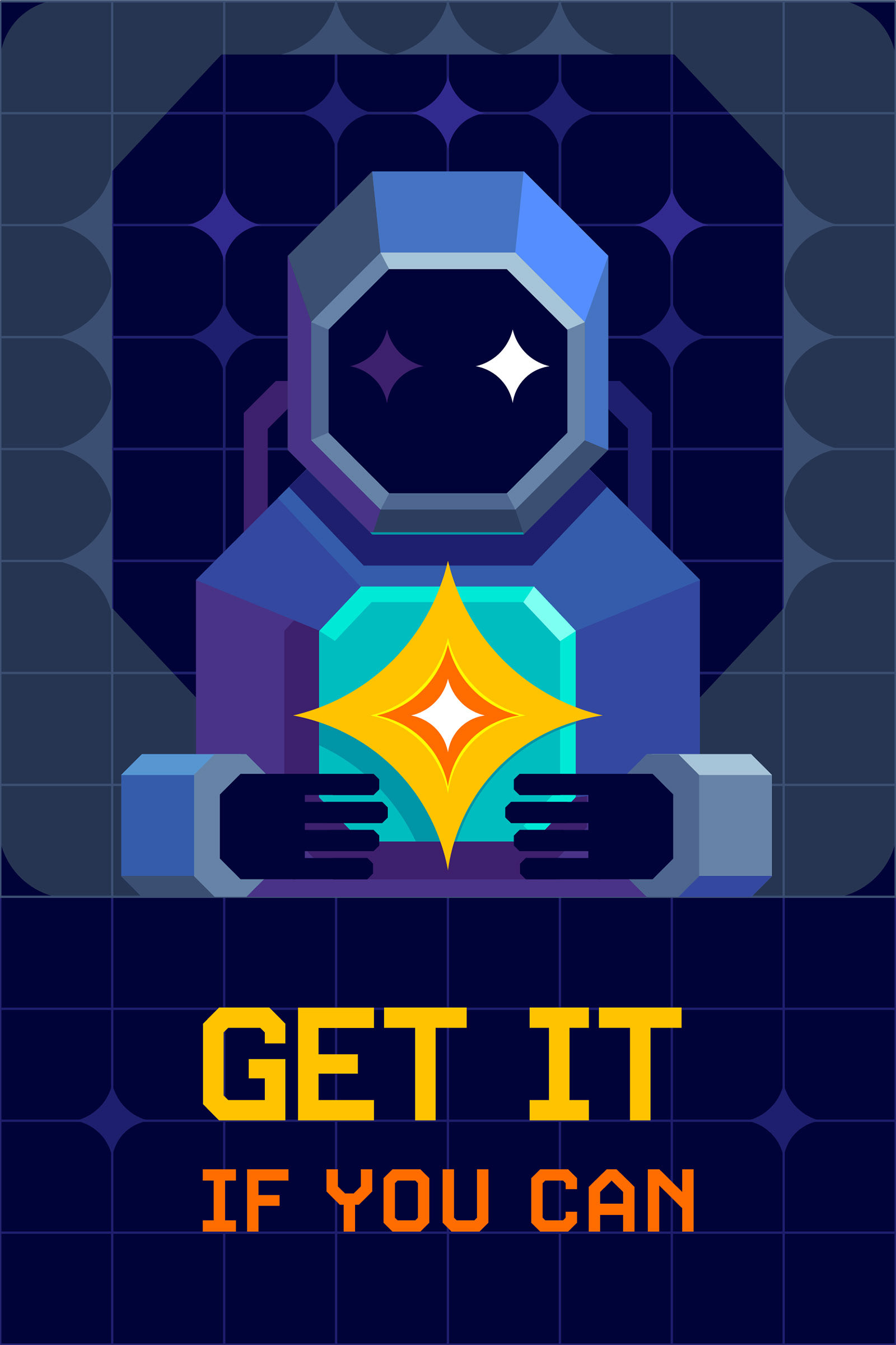
CHARACTER: cover picture
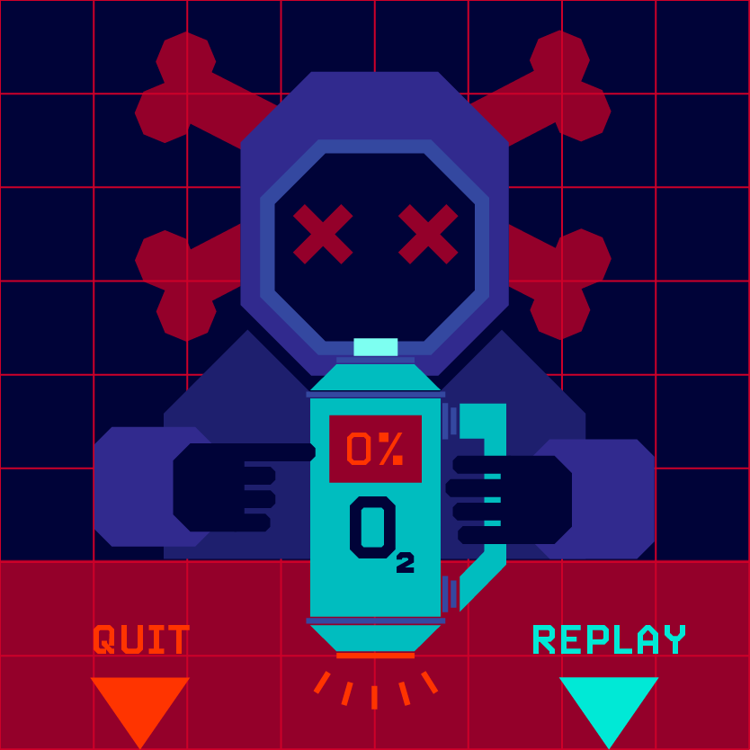
CHARACTER: out of oxygen
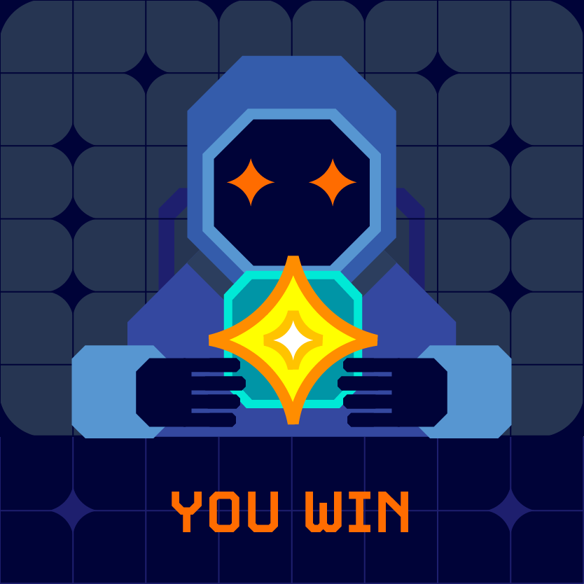
CHARACTER: you win
________________________
SCREENS AND ANIMATIONS
SCREENS AND ANIMATIONS
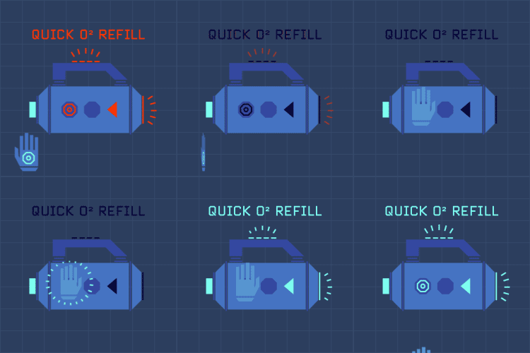
Quick oxygen refill
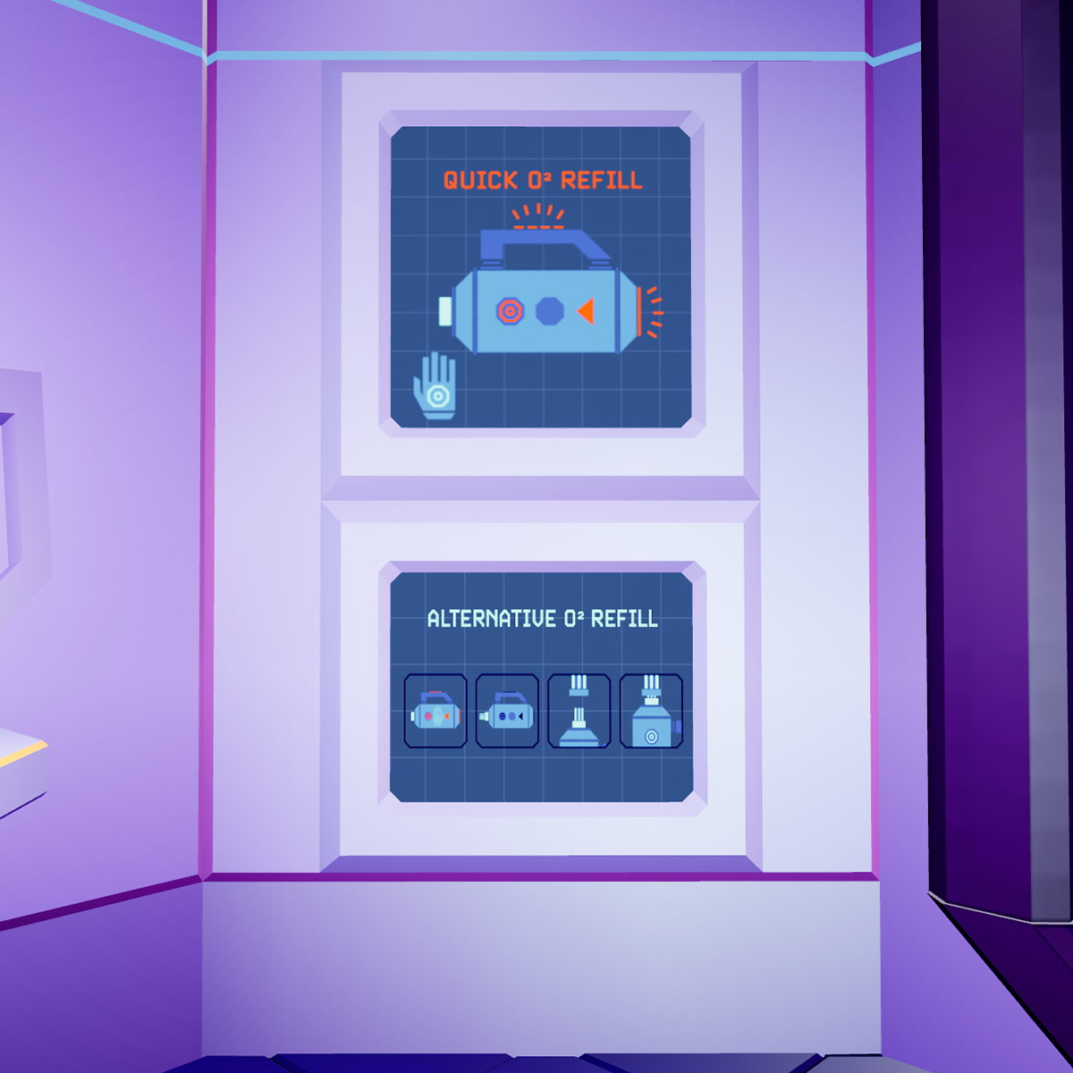
Oxygen refill screens
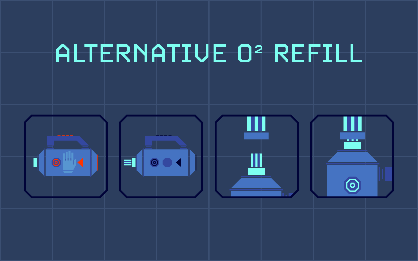
Alternative oxygen refill
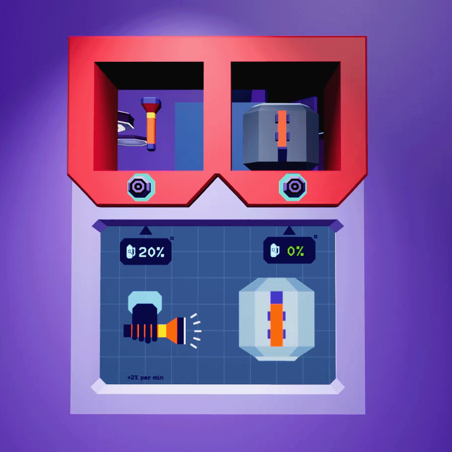
Fasten the torch on the helmet screen
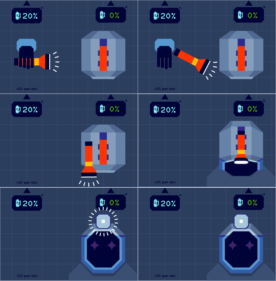
Fasten the torch on the helmet
