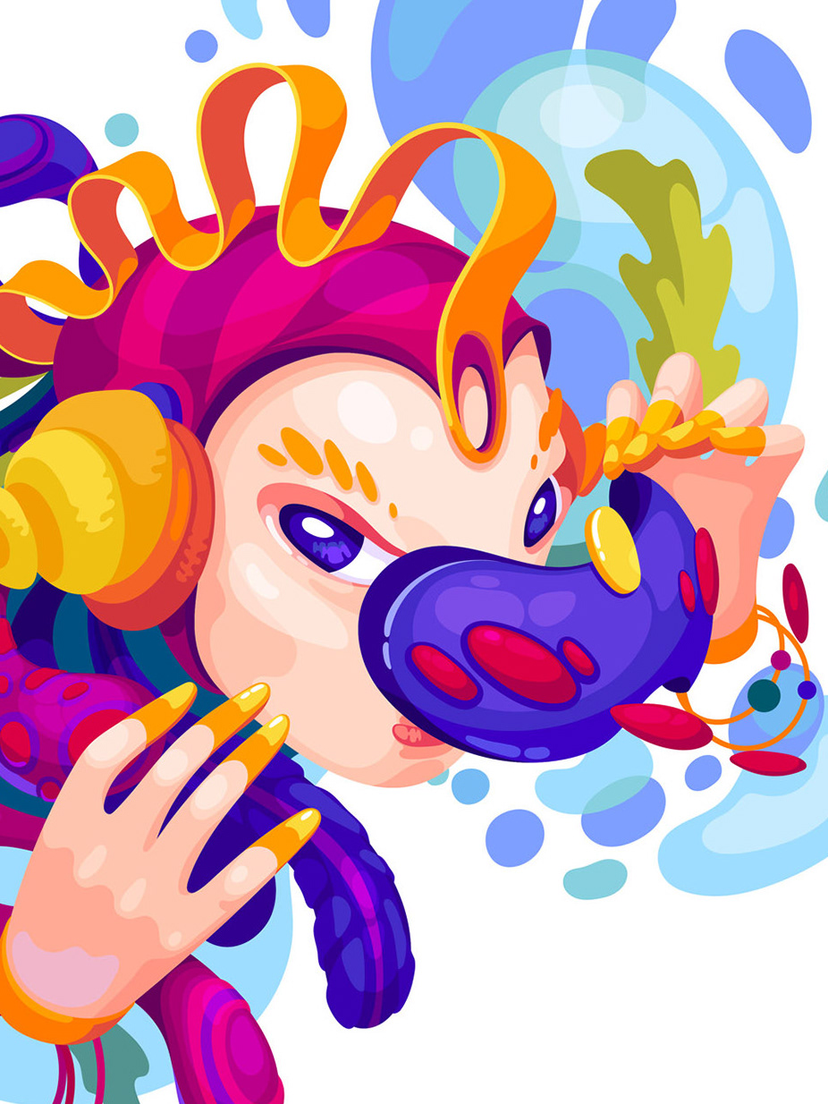
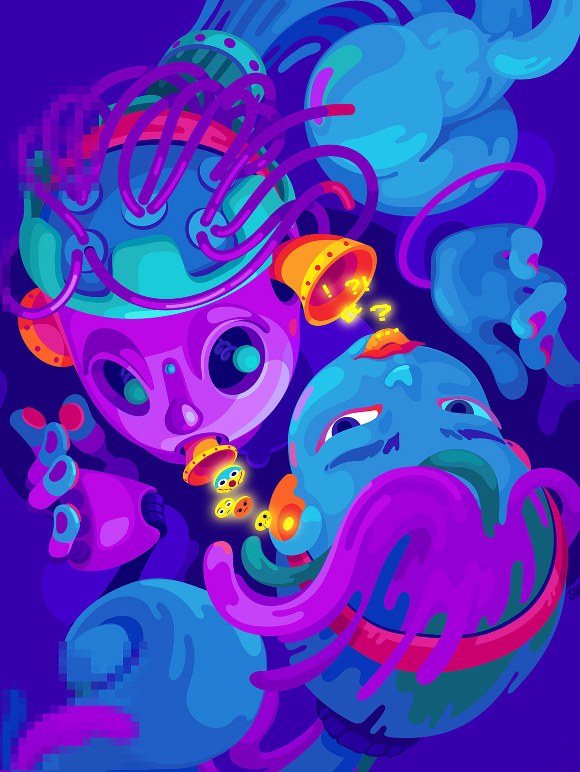
A cover illustration for issue 53 of the magazine Replikk". Theme DIGITAL
I have done a total of 3 works for this issue. This page is about the cover illustration. The other two works you can find here:
• Talking to AI Replika
• Little profiling bug
THE COVER ILLUSTRATION
Articles in the issue touch upon topics such as new technologies, artificial intelligence, digital culture, Big Data, profiling, and power. But one way or the other most of them reflect an idea that the technologies move and change way faster than people manage to adapt to them.
On the other hand, all the problematic consequences of the new technologies relate back to the matters that humanity has been struggling with since its dawn - the imbalance of power, relation to death, identity, freedom, and control of resources.
I thought this contrast between the new and the old was intriguing. It seems to be lying at the base of the discourse about technologies nowadays and, therefore, must be reflected in the cover image. So I depicted that contrast by letting a caveman wear gadgets that we have now.
I thought this contrast between the new and the old was intriguing. It seems to be lying at the base of the discourse about technologies nowadays and, therefore, must be reflected in the cover image. So I depicted that contrast by letting a caveman wear gadgets that we have now.
Tasks:
• Understand the general topics that the magazine issue presents.
• Find a red thread between these topics. Give it a visual form.
• Make several sketches and discuss the ideas with the magazine editor.
• Create the final illustration.
• Prepare the picture for print.
Tools:
• Procreate
• Adobe Illustrator
• Adobe Photoshop
VISUAL STYLE
Along with creating illustrations, I was also a part of a team of 4 working on the general visual theme of the issue. We defined headers' style, color palette, and other unifying elements.
We decided that the topic DIGITAL is best and most concisely reflected in pixelation as a visual effect. Therefore all the illustrations in the issue are either fully or partially pixelated.
The color palette was inspired by the old computer and game aesthetics - bright primary colors and blue as the prevailing color.
__________________
Take a look at the other two works for Replikk".
Take a look at the other two works for Replikk".

